Construction Website Examples: 10+ Ideas for a Better Contractor Website
The short answer
The best construction website examples share the same patterns: a first screen that says what the business does, where and why to trust it, credentials shown early, projects with location, scope and timeline, one clear primary action, and a design that fits the buyer. The 12 live demos below show each idea in context.
Twelve construction and contractor website examples, from plumbers to heritage builders, with what makes each one work and the idea worth taking for your own site.
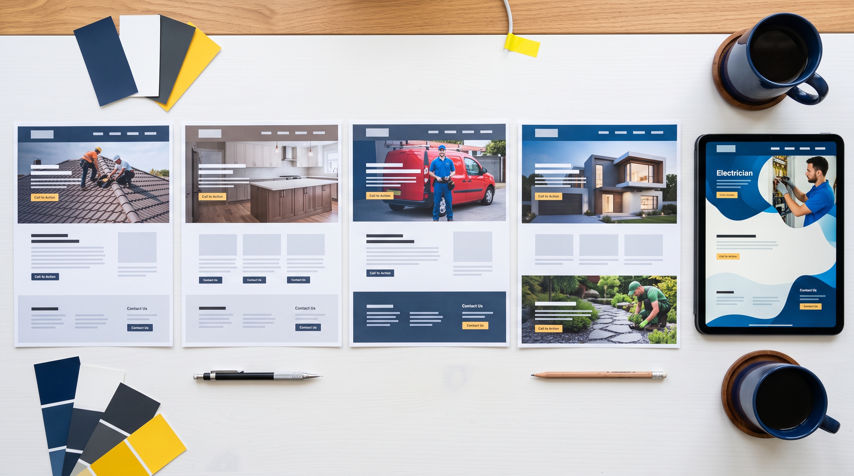
Looking at construction website examples is the fastest way to work out what you want from your own. The trick is to look past the colors and fonts and ask why a site works: what it tells a visitor first, how it proves the business is legitimate, and how easy it makes the next step.
The twelve examples below are demo sites we built for different parts of the US construction industry. The businesses are fictional, but every layout, trust signal and call to action reflects what works on real contractor sites. Each one is live, so you can click through and see the ideas in context.
1. Brassline: plumbing that leads with urgency
Brassline is built for a plumbing and heating company in Houston. The header carries a click-to-call number and an emergency line, and the hero pairs “Book a plumber” with a promise of a fast emergency response.
What works: Big, scannable numbers for 24/7 service, fixed pricing and warranty length, plus the state Master Plumber license shown upfront.
Idea to borrow: If you take emergency calls, say how fast you respond in the first screen, in a number.
2. Ridgemark: roofing built on credentials
Ridgemark targets a roofing contractor in Atlanta. An emergency bar sits above the hero, and the main action is “Book a free roof inspection”.
What works: A dedicated row of manufacturer certifications and ratings, project cards showing location, square footage and duration, a service-area map, and a quote form with an “urgent leak” checkbox that sorts emergencies from planned work.
Idea to borrow: Add one checkbox to your form that flags urgent jobs, so you call those back first.
3. Voltline: an electrician that feels responsive
Voltline is for a Phoenix electrician covering EV chargers, panel upgrades and smart-home work.
What works: A live-style dispatch widget showing a technician en route, which signals speed without saying “fast”. Credentials such as the state license, code standard and EV installer status appear as badges right under the hero.
Idea to borrow: Show, don’t claim. A visible sign of responsiveness beats the word “reliable”.
4. Renovia: remodeling with published pricing
Renovia is a Denver home renovation company.
What works: Three published pricing tiers, a clear timeline for when a client receives a brief and a fixed price, and tiered workmanship guarantees. A featured case study includes duration, budget and a client quote.
Idea to borrow: If price is the first question you hear, answer it on the site with a range or starting price. It filters out poor-fit leads before they call.
5. Joinwright: a personal, owner-led site
Joinwright is a Seattle custom carpentry and millwork shop.
What works: The phone number is the primary button, framed as talking to the owner directly. Projects list the wood species, area and weeks taken, and reviews from Google and Houzz sit alongside a service-area map.
Idea to borrow: Small firms win on personality. Put the owner’s name and face on the site and make it clear who picks up the phone.
6. Halden & Co.: premium positioning for heritage work
Halden & Co. is a high-end general contractor in Charleston focused on heritage and civic projects.
What works: Serif type, restrained copy and a confident tone that says the firm is selective. Trust comes from decades in business, multi-state licensing and industry honors, not from discount offers.
Idea to borrow: Your design should match your price point. Premium work deserves a calmer, more editorial site.
7. Constructum: a design-build firm with a deep case study
Constructum is a Dallas design-build contractor serving residential and commercial clients.
What works: Trust badges directly below the hero, one detailed case study with budget and duration, and a contact form that asks for location and a short project brief.
Idea to borrow: One well-documented project often persuades more than twenty thumbnails.
8. Trunkline: built for B2B buyers
Trunkline is a pre-construction plumbing contractor selling to general contractors in Texas.
What works: A technical, spec-sheet look that speaks the buyer’s language, a material specification table, metric-heavy case studies, and an availability calendar with a booking form that asks for the plot survey and fixture count.
Idea to borrow: If you sell to GCs, collect what you need to price the job in the first form.
9. Hedgerow: a calm, consultative landscaper
Hedgerow is an Orlando landscape design and build studio.
What works: A soft, unhurried tone, a five-phase process that sets expectations, and a free site visit as the main offer. The form invites photos of the yard.
Idea to borrow: Asking for photos upfront makes your first call better and shows you take the project seriously.
10. Solidcraft: education as a selling point
Solidcraft is a Nashville masonry and bricklaying firm.
What works: A “Bond Library” section explaining brick patterns, which gives homeowners the language to describe what they want and positions the firm as the expert.
Idea to borrow: Teach one thing about your trade on your site. It earns trust and search traffic at the same time.
11. Stackline: speaking to architects
Stackline is a Las Vegas contractor that works closely with architecture firms.
What works: A video showreel, testimonials from named design firms, and a featured case study listing scope, area and architect.
Idea to borrow: Choose testimonials from the type of client you want more of.
12. Northcrest: a commercial GC with clear scale
Northcrest is a residential and commercial general contractor in the Carolinas.
What works: Headline metrics on projects delivered and on-time rate, a four-phase process, and a contact form with a service dropdown. Phone and email sit in the header.
Idea to borrow: Commercial buyers want proof of scale. Lead with completed project value, volume and delivery record.
What the best construction websites have in common
Across every one of these contractor website examples, the same patterns repeat:
- The first screen says what the business does, where, and why to trust it
- Credentials such as licenses, insurance, certifications and warranties are visible early
- Projects come with context: location, scope, timeline or budget
- There is one clear primary action, and the phone number is always within reach
- The design fits the buyer, whether that’s urgent and direct for emergency trades or calm and editorial for premium builders
Mistakes to avoid when copying ideas
Inspiration is useful, but copying another firm’s site wholesale rarely works. Avoid stock photos of models in clean hard hats, sliders that hide your main message, vague headlines with no service or location, and contact details that only appear in the footer. And never reuse another company’s copy, because duplicate text hurts your rankings and your credibility.
FAQs about construction website examples
Can I copy a design I like from another contractor?
Borrow ideas such as layouts, section order and trust signals, but never their copy or photos. Duplicate content hurts rankings, and using another firm’s photos misleads customers.
What makes the best contractor websites stand out?
Clarity. Visitors know within five seconds what the business does, where it works and how to get in touch.
Turn ideas into your own site
Every demo above can be adapted to your trade, brand and service area. Read construction website design: what a high-converting contractor website needs for the full feature list, or browse all live demos on our homepage. We build custom construction company websites at a fixed price from $2,000, live in seven days. Book a free 15-minute call and tell us which example you liked.
Want a website that brings in work like this?
Fixed price, live in seven days, built only for construction firms. Book a 15-minute call and we will tell you straight what we would do.